Challenge
While at Zooka Creative, our team was given the challenge of revitalizing the branding and website of a local symphony. The aim was to craft a brand that exuded forward-thinking, confidence, and inclusivity, while upholding the esteemed legacy of the institution.
Keeping a tight budget in mind, the team wanted to push the symphony's best foot forward without compromising the thought behind both content and design strategies.
Industry
Performing Arts
Services
Concept Ideation,
Art Direction, UX, UI
Art Direction, UX, UI
Exploration & Surveys
The team embarked on crafting a logo that stretched the boundaries of the client's expectations, aiming to attract a fresh audience while also energizing their existing viewers and listeners. Central to our exploration was the concept of infusing energy and musicality into a confined space, igniting a sense of vibrancy. Concurrently, we remained committed to honoring the extensive prior research conducted on defining their brand personality, emphasizing qualities such as curiosity, sophistication, and confidence.
After delving into numerous design options, the Zooka team conducted a comprehensive survey of a diverse audience to gain valuable insights into how potential brand identities might be perceived. Paid audience and stakeholder responses were accounted for separately. Participants rated logos in order by responding to statements such as "We are more than classical music, we push the boundaries of orchestral performances." and "This evokes the feeling of live music."
Brand Identity
The final logo chosen captures the essence of sheet music and visualizes the movement of sound waves in that space, evoking a sense of rhythm and vitality. It embodies energy pulsating through a theater. The chosen mark was created by our designer, Timothy Duong.
Color
Thoughtfully selected hues epitomize sophistication, assurance, and a spirit of inclusivity, aligning seamlessly with the client's vision. The deep navy exudes elegance, paying homage to the rich heritage and mastery of the craft, while the vibrant burst of pink in the logo mark symbolizes a forward-looking approach, brimming with confidence and vitality.
Website
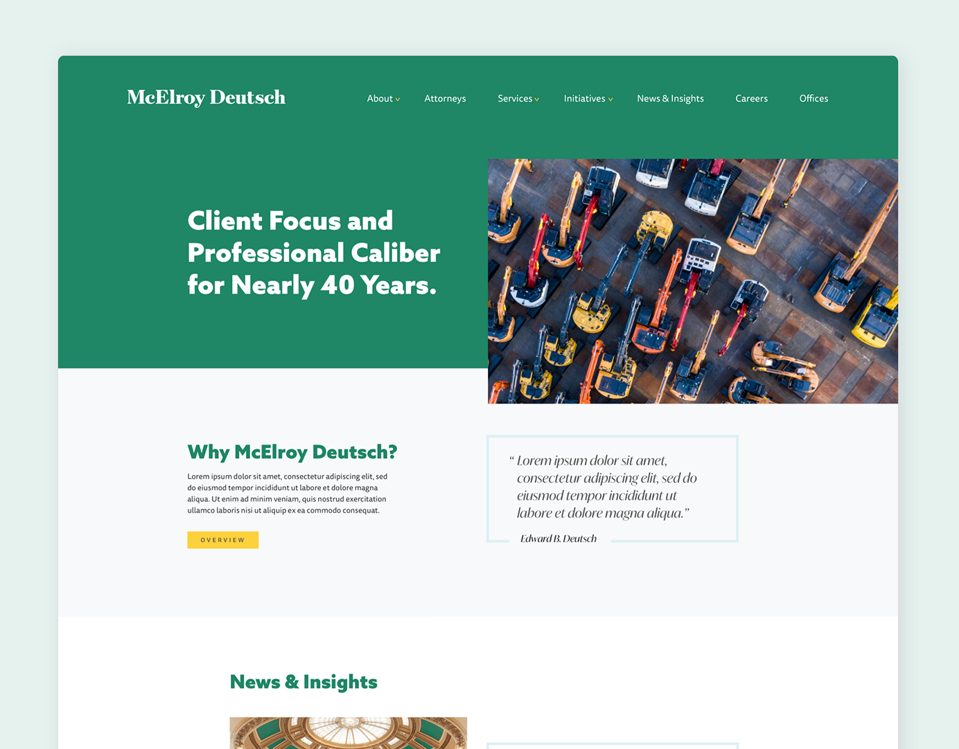
The objective was to elevate the site beyond its basic function of providing information and ticket sales. Collaborating with content strategists, the team devised a solution designed to pique curiosity, captivate newcomers, and seamlessly guide users through both discovering upcoming concerts and events, and purchasing tickets. In addition to creating an easy experience, the team's goal was to create a website that is flexible and easy for the client to maintain by creating set blocks for users to input new information and add images. The client's internal design team wanted a way to incorporate a series of AI images to go with their concert series, so it was also important for the new website to be able to house a variety of image types while remaining compliant with ADA guidelines.
