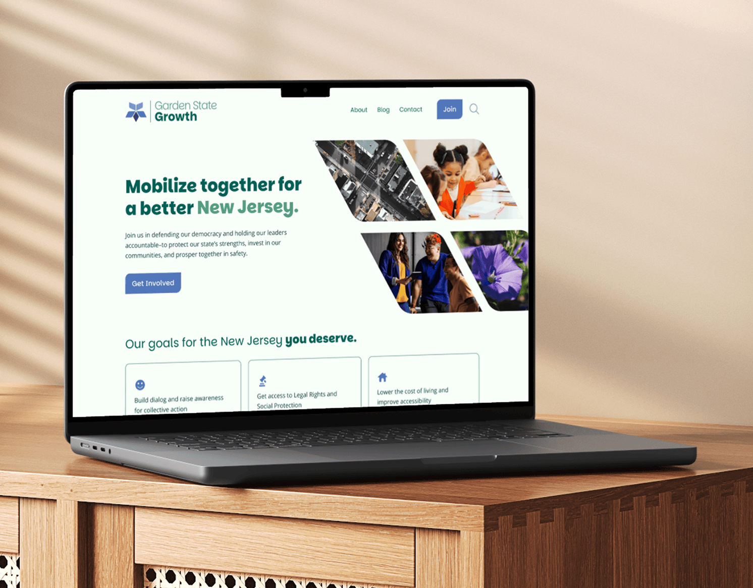
Challenge
Beauty News NYC is a vibrant digital publication supported by a talented team of writers who explore the latest trends in beauty, lifestyle, travel, and more. While their content consistently delivers value, the original brand lacked a cohesive visual language and strategy that truly connected with their audience.
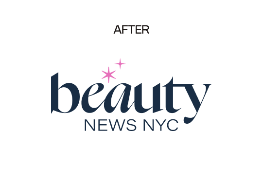
The challenge was to evolve the existing brand—honoring its legacy while crafting a new visual identity that better resonates with their current readers. We began by conducting a survey to gain insights into their goals and desired perception. This case study highlights how our discoveries shaped the final design, balancing past and future to create a compelling, aligned brand identity.
Industry
Editorial, Beauty, Lifestyle
Services
Brand Strategy, Brand Design
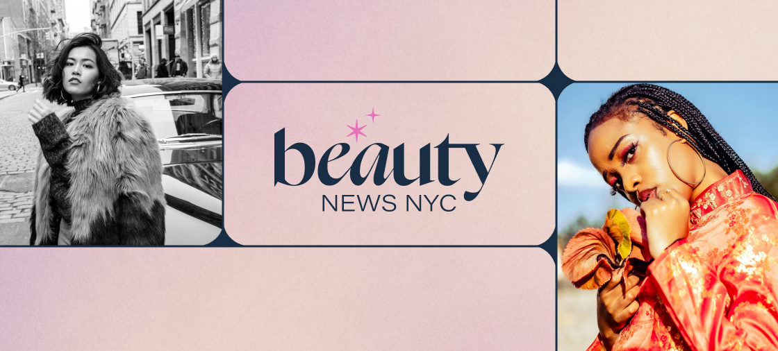
Logo
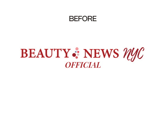
When creating the brand identity, the Beauty News NYC team knew they wanted to keep elements of the old, while creating something new. The dots in the original represent diversity and a touch of fun, feminine energy. The goal was to take this and add a spin to it. As their page says, “We don’t pretend to love everything—we only feature things we actually love. And our coverage goes way beyond the surface: we have range, depth, and personality”.
Pillars
We focused on the following pillars to drive the brand.
Authority and Longevity | Indie Spirit & Genuine Curation | Diversity & Inclusivity | Joyful Discovery | Smart, Stylish, & Grounded

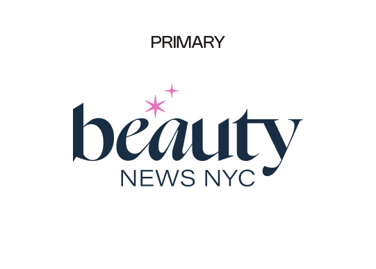
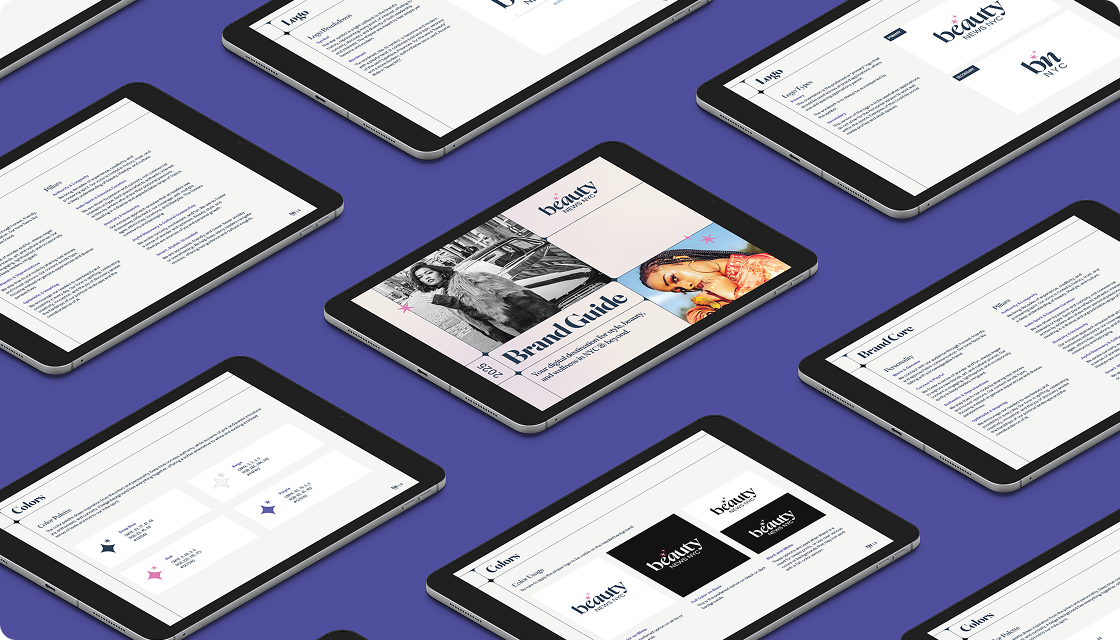
Final Design
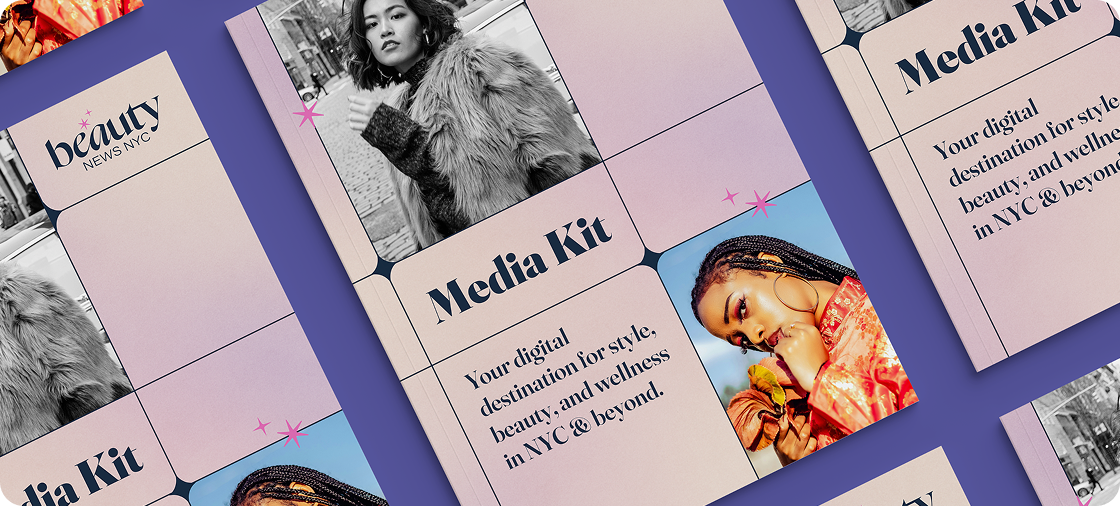
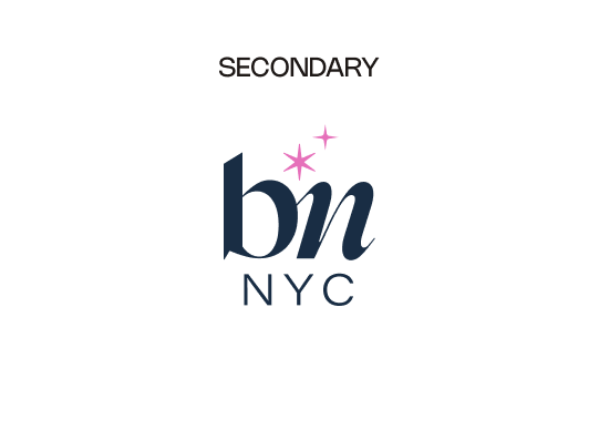
The final identity positions itself as a distinctive digital magazine that stands out from its competitors. By using both regular and italic styles of the Fraunces typeface, the design conveys a voice that appeals to readers who value trustworthy, tested information rather than paid promotions, while also showcasing a playful, feminine touch. Complementing this, the sans-serif Acumen Wide adds an editorial, stylish vibe that balances professionalism with personality.
Using star symbols is a light callback to the brand’s history, representing many point of interest, alluding to curiosity, discovery, and diversity of both readership and interests. The shapes are meant to feel simple yet feminine and modern.
The change in color palette was made in better understanding its readers. The main color used is dark blue and uses a light beige as its background to foster the sense of trust without using the same black and white so commonly seen with competition. The pink in the logo and uses of purple are just a light tough throughout the branding to bring back play, discovery and excitement.